Hello! Sorry it's taken me so long to find this. I've been doing so much traveling and apartment hunting and gosh but this is the first chance I've had to catch up on everything I've been neglecting. You two have been posting some beautiful art here and it's making me so nostalgic for UArts and how inspiring it was coming to class each day.
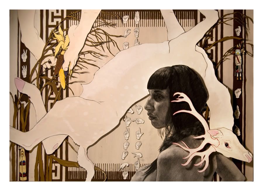
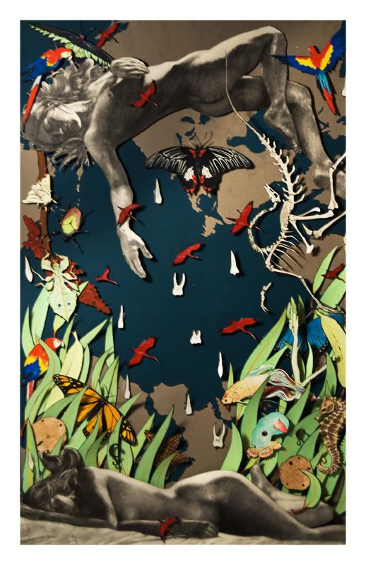
I don't know if I showed these to you already, but here is the revised version of that piece I did for Phyllis and a piece I did for Meghan. Any critiques would be wonderful. I feel terrible that I haven't made any art all summer so hopefully this'll shake me up and get me working again.

5 comments:
What you lack in quantity, you more than make up for in quality, Travis.
You hit the nail on the head with the first one. All of the previous order and hierarchy problems are solved beautifully. The variant of whites really ties it all together in a readable and not-too-distracting way.
The second one I've either never seen before, or you've changed it so much that I don't recognize it. Either way the figures against the dark blue map and bright grass are pretty stunning. In comparison, the bright contrasty stuff (teeth and birds)in the middle kind of kills it. You could probably do without it entirely, or make them smaller/more sparse/duller/arranged specifically... anything that will make them an embellishment rather than a focal point.
It seems like you have the same problems on the bottom one that you originally had on the top one, so I'm confident you can solve it successfully. Try applying the same changes.
In a word; awesome. The best stuff I've seen you do so far (which is saying a lot)
travis!
i love you.
i agree almost entirely with jimmy, here. the solution of the background pattern makes everything look so stable and cohesive...lovely. as for the second one, yeah, the arrangement of the embellishments like the teeth and scarlet birds seems to be just a little bit too structured, and is coming across as a shape unto itself, as opposed to a connecting region of the composition. perhaps positioning the items in such a way as to create a cascading effect (higher concentration trickling down to a lower concentration) between the figures would help out a bit.
regardless, it's a remarkably strong piece, and everything is obviously so cared for. i simply can't help but to love it, even if some compositional issues are left unaddressed.
i hope that you're doing well, travis! thanks for making it over here despite, i imagine, being incredibly busy! we just need to start planning a day to visit you now. :oP
oh my! looking at your second piece (once again), i *just* noticed that the papilio memnon was done with my photo as reference! funny. :o)
http://www.flickr.com/photos/thewoozle/1849078745/in/set-72157603415725463/
Thank you, you two!
I'm still struggling with controlling values when I'm using paint, so it's great to hear that the first one with the deer is more successful. Both of your suggestions for the second piece are really helpful. I took out the teeth and left the birds and it's already looking a lot better. I'm going to shift things around a little and see if that helps (Sara, I like your idea of cascading elements). Eventually I need to find a way to put these all together with something other than removable tape, and figure out how to build a frame.
You two are super helpful, thank you
Also, Sara I've saved all of your butterfly photography for reference
it's all so beautiful
Post a Comment